
Cart
0
A poster can be beautiful on its own, but a frame is what makes it feel intentional. Posters with frames tend to read as “finished”, they look more like collected art than temporary decor, and they instantly elevate a wall without requiring a full redesign.
This guide focuses on quick, practical ways to use framed posters to upgrade a room, from choosing the right frame style and size to hanging, protecting, and styling your pieces so they look considered (not accidental).
Why posters with frames look instantly more expensive
Framing changes how the eye reads a print. Even a simple poster gets a stronger presence when it has a defined edge, consistent proportions, and a material (wood, metal, acrylic) that relates to the rest of the room.
Here’s what framing does, in plain terms:
- Adds structure and contrast: a frame creates a visual boundary, which helps the artwork stand out from the wall colour.
- Improves “visual weight”: a framed poster holds its own next to furniture, rugs, and lighting.
- Makes styling easier: a black frame, white frame, or natural wood frame can tie together mixed colours in a space.
- Protects the print: keeping the poster behind glazing reduces scuffs, dust, and handling damage.
If you want an easy upgrade with minimal decision fatigue, picking one consistent frame finish (for example black, white, or oak) and repeating it across a room is one of the fastest ways to make walls look curated.

Start with the frame size (and avoid the most common sizing mistake)
The most common frustration with framing posters is ordering a frame that technically “fits”, but looks wrong on the wall. The difference is usually margin and proportion, not just centimetres.
When you choose a frame, you have two clean-looking options:
Option 1: A frame that matches the poster size exactly
This gives a crisp, modern look, and it is great for bold photography, graphic design, and high-contrast illustrations.
What to watch for: without a mount (mat), some posters can look a little tight, especially if the artwork has light edges.
Option 2: A larger frame with a mount for breathing room
A mount creates a border of space around the print so the artwork feels more “gallery-like”. It also helps smaller posters feel substantial on larger walls.
What to watch for: choose a mount colour that supports the art. White is classic, off-white feels softer, black is dramatic but can overpower delicate designs.
Quick sizing cheat sheet (EU and UK-friendly)
Use this table as a starting point when you want either a tight fit or a framed, mounted look.
| Poster size | “Exact fit” frame size | “Elevated” look frame size (with mount) | Best for |
|---|---|---|---|
| A4 (21 x 29.7 cm) | A4 | A3 | Small nooks, shelves, bedside styling |
| A3 (29.7 x 42 cm) | A3 | A2 | Hallways, desk walls, layered decor |
| A2 (42 x 59.4 cm) | A2 | A1 | Statement pieces without overpowering |
| 30 x 40 cm | 30 x 40 cm | 40 x 50 cm | Modern interiors, neat grid layouts |
| 50 x 70 cm | 50 x 70 cm | 60 x 80 cm | Sofas, beds, large blank walls |
If you are unsure, the “elevated” option is often the safer bet for living rooms and bedrooms because the mount helps the piece feel more premium and intentional.
Choose a frame style that matches the room (not just the poster)
A frame is part of your interior, not just a border around the artwork. A simple way to decide is to match the frame to one existing “hard” element in the room (metal finishes, wood tone, or high-contrast accents).
Black frames: crisp, modern, and high-contrast
Black is the easiest choice for making a wall look pulled together, especially on light walls. It works particularly well with:
- Graphic posters and typography
- Black-and-white photography
- Contemporary illustration
Design tip: if your room already has black accents (table legs, lamp bases, window frames), repeating black frames makes everything feel more cohesive.
White frames: light, airy, and minimal
White frames are excellent when you want the wall to feel calm, especially in smaller rooms where contrast can feel busy.
They pair well with:
- Pastel art
- Line drawings
- Light, Scandinavian-style interiors
Design tip: if the wall is also white, use a mount or choose a slightly different shade (off-white mount, bright white frame) so the edges don’t disappear.
Natural wood frames: warm and timeless
Wood adds softness and warmth, which is ideal for making posters feel less “new” and more collected.
They work well with:
- Earthy colour palettes
- Landscapes and nature photography
- Retro and mid-century styling
Design tip: match the wood tone to one other object (coffee table, shelves, flooring undertone). You do not need an exact match, just the same temperature (warm vs cool).
Metallic frames: sleek and slightly architectural
Aluminium or metallic finishes suit contemporary interiors and can make colour-heavy posters feel more polished.
They work well with:
- Abstract art
- Architecture photography
- Industrial interiors
Design tip: if you have mixed metals in the room, keep frames consistent (all brushed silver, for example) and let hardware vary elsewhere.

Don’t overlook glazing (it affects both looks and longevity)
Framing is not only about aesthetics, it is also about protecting paper.
Two practical points matter most:
1) Reflections vs clarity
If a poster is opposite a window or near a bright lamp, reflective glazing can make it hard to see the artwork at certain angles. If you know you have lots of light, consider a framing option that reduces glare.
2) Light exposure and fading risk
Works on paper can fade when exposed to strong light over time. Museums and conservation professionals consistently recommend reducing exposure to direct sunlight and strong UV.
A straightforward, high-impact habit is simply this: avoid hanging prints in direct sun, or use curtains/blinds during the brightest parts of the day.
For practical preservation guidance, see the Library of Congress preservation resources (excellent, non-technical advice for caring for paper-based items).
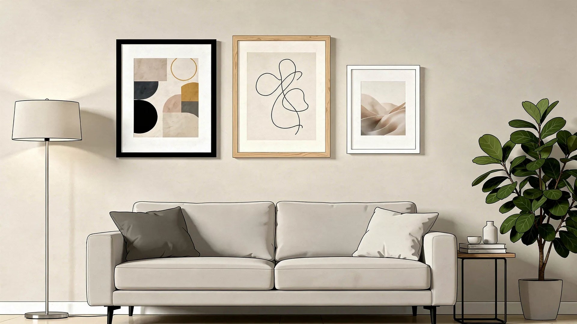
Easy ways to elevate walls with framed posters (no full gallery wall required)
A gallery wall can look amazing, but it is also a project. If your goal is a fast upgrade, these approaches deliver a “designed” feel with less planning.
Create one oversized focal point
If you have a blank wall and you want immediate impact, a single larger framed poster often looks more premium than several small pieces.
Where it works best:
- Above a sofa
- Above a bed
- In a dining area where you want a focal point
Visual rule that helps: aim for the frame to be roughly two-thirds the width of the furniture beneath it (approximate is fine).
Use a matched pair for symmetry
Two framed posters of the same size create instant structure. This is one of the easiest ways to make a hallway, landing, or bedroom wall look “finished”.
Good pairings:
- Two complementary colours (warm vs cool)
- Same theme (two abstracts, two photographs)
- Same frame finish and mount colour
Build a simple trio (same size, same frame)
Three framed posters in a row reads as intentional styling, even if the artworks are different.
This works especially well above:
- Sideboards
- Console tables
- Long desks
Spacing tip: keep gaps consistent. Even spacing matters more than “perfect” centring.
Layer framed posters on a shelf or ledge
If you like switching art seasonally, leaning framed posters on a picture ledge is flexible and renter-friendly.
To make it look polished:
- Put the largest frame at the back
- Add one smaller frame in front
- Include one object with a different texture (ceramic, plant, books) to break up rectangles
Room-by-room framing tips that make a big difference
Living room: pick one frame finish and repeat it
The living room has the most visual competition (sofa, lighting, textiles). Repeating one frame colour helps your wall art feel cohesive.
A reliable formula:
- Black frames + white mounts for a modern look
- Natural wood frames + off-white mounts for a softer look
Bedroom: soften contrast for a calmer feel
Bedrooms usually benefit from lower contrast and gentler tones.
Try:
- White or light wood frames
- Larger mounts (more breathing room)
- Calmer themes and muted palettes
Hallways and staircases: go vertical
These spaces often feel awkward because they are narrow. Vertical framed posters (or portrait orientation) visually lift the space.
If the hallway is dark, choose lighter frames or lighter mounts to avoid the wall feeling heavy.
Kitchen and dining: choose easy-to-clean framing
Kitchens can have humidity and airborne residue. Framed posters are still a great choice, just be intentional about placement.
Practical tip: keep framed prints away from direct splash zones and heavy steam (immediately next to the hob, kettle, or sink).
For broader home humidity guidance, the UK Government’s advice on damp and mould is a useful reference for prevention and ventilation habits.
Home office: use framed posters to influence focus
A home office wall is a chance to shape mood. Framed posters that feel structured (clean lines, strong composition) often support a focused vibe.
Placement tip: if you take video calls, consider placing one framed poster behind you, centred, rather than multiple small pieces that can look busy on camera.
Hanging framed posters neatly (without making it complicated)
You do not need specialist tools to get a professional result, but you do need a repeatable method.
Get the height right
A simple rule is to hang art so the centre of the frame is around eye level for the people who use the room most. If you are hanging above furniture, keep the gap visually connected so the art does not float too high.
Keep alignment consistent
Most “something feels off” moments come from inconsistent alignment.
Pick one approach and stick to it:
- Align frame tops for a clean, modern look
- Align centres for a more classic look, especially with mixed sizes
Match the fixing to the frame weight
For lightweight frames, removable hanging strips can work well on suitable walls. For heavier frames, use proper wall fixings for your wall type.
If you are unsure, a local hardware shop can usually recommend the right plug and screw combination based on the weight and whether your wall is plasterboard or masonry.
How to keep framed posters looking new
A few habits keep posters crisp for years:
- Dust gently with a clean, dry microfibre cloth (especially around frame edges).
- Avoid direct sunlight where possible, or use blinds during peak brightness.
- Keep away from heat sources like radiators and fireplaces that can dry materials unevenly.
- Check hooks annually if the frame is heavy or in a high-traffic area.
If you ever need to move framed posters, carry them by the frame sides rather than the top edge.
Frequently Asked Questions
Are posters with frames worth it? Yes if you want a finished, intentional look. A frame adds structure, helps the artwork stand out on the wall, and offers practical protection against scuffs and dust.
Should I choose a frame the same size as the poster? An exact-size frame looks clean and modern. If you want a more premium, gallery-like feel, choose a larger frame with a mount so the poster has breathing room.
What frame colour goes with everything? Black is the most versatile for modern interiors and high contrast. Natural wood is the most forgiving for warm, lived-in spaces. White is best when you want an airy, minimal look.
Do I need a mount (mat) for a framed poster? You do not need one, but a mount often makes a poster look more expensive and intentional, especially for smaller sizes on larger walls.
How do I stop framed posters from fading? Keep them out of direct sunlight where possible and use window coverings during the brightest hours. Light exposure is a major contributor to fading for works on paper.
Is acrylic or glass better for framing posters? Both can work well. Acrylic is lighter and often preferred where safety matters (for example high-traffic areas), while glass can feel more traditional. The most important factor is good placement and avoiding direct sun.
Elevate your walls in minutes with framed art you actually love
If you want the “done” look without the hassle, framed posters are one of the simplest upgrades you can make to a room. At dreamprint.art, you can shop curated posters and art prints from contemporary artists, choose from multiple sizes and framing options, and get ready-to-hang pieces made on demand and shipped worldwide (with free shipping).

