
Cart
0
Updated on: March 22, 2026
Discover how to transform your living room with vibrant artwork that brings personality and warmth to your space. Learn about common design mistakes to avoid, explore the pros and cons of different print styles, and get practical tips for selecting the perfect pieces. Whether you're redecorating or refreshing your home, this guide will help you create a visually stunning and cohesive living environment.
Table of Contents
- Common Mistakes to Avoid
- Pros and Cons Analysis
- Quick Tips for Success
- Wrap-Up and Key Insights
- Frequently Asked Questions
Introduction
Your living room is where memories happen. It's where you unwind after a long day, gather with loved ones, and show off your personal style. So why settle for boring, neutral walls? Vibrant artwork has the power to completely transform your space, and the good news is that you don't need to be an interior design expert to pull it off.
If you're thinking about adding colorful prints for your living room, you're on the right track. Bold, vibrant art brings energy, warmth, and character to any space. But with so many options available, how do you know what works best for your home? That's exactly what we're going to explore together in this guide.
We'll walk through the common pitfalls people make when choosing wall art, weigh the pros and cons of different approaches, and give you practical tips you can use right away. By the end, you'll feel confident creating a living room that truly reflects who you are.
Common Mistakes to Avoid
When it comes to decorating with vibrant artwork, even small missteps can throw off your entire room's vibe. Let's look at the most common mistakes people make, so you can steer clear of them.
Ignoring Your Existing Color Palette
One of the biggest blunders is choosing artwork without considering the colors already in your room. If your furniture and accent pieces lean toward warm tones, selecting cool-toned prints can create visual conflict. Take a moment to identify your room's dominant colors—whether that's blues, greens, warm neutrals, or earth tones—and then select artwork that either complements or thoughtfully contrasts with them.
Going Too Bold Too Fast
We get it: bright, eye-catching pieces are exciting. But jumping straight to the boldest, most saturated colors without considering your space's size and lighting can feel overwhelming. A massive, intensely colored print in a small room might feel cramped rather than inviting. Start with one statement piece and build from there.
Forgetting About Scale and Proportion
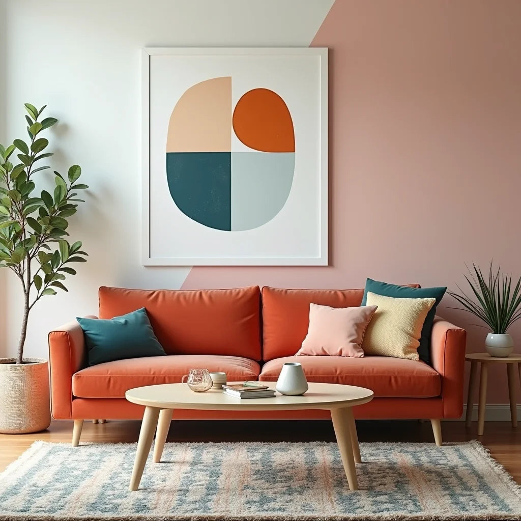
Choosing artwork that's too small for your wall is surprisingly common. A tiny print floating alone on a large wall just looks lost. Conversely, oversized artwork in a modest space can dominate the room. The rule of thumb is that your artwork should take up about 50 to 75 percent of the wall space above your sofa or main furniture piece.

Bold geometric shapes and warm sunset hues creating visual harmony and balance.
Mixing Too Many Styles
Combining abstract prints with landscape photography with vintage pop art might seem eclectic and fun, but it can actually feel chaotic. Stick to a cohesive aesthetic—whether that's modern, botanical, abstract, or vintage—and build your collection around that theme.
Neglecting Lighting Conditions
The way light hits your artwork throughout the day matters more than you'd think. Natural light can shift the appearance of colors, while poor lighting can make even stunning pieces look dull. Before finalizing your choice, observe how your walls look at different times of day.
Pros and Cons Analysis
Pros of Adding Vibrant Artwork to Your Living Room
- Instant Personality: Colorful prints express your unique taste and make your space feel distinctly yours.
- Mood Enhancement: Bright, energetic colors can boost your mood and create a welcoming atmosphere for guests.
- Visual Interest: Well-chosen artwork draws the eye and creates focal points that anchor your room's design.
- Affordability: Compared to other home improvements, prints and framed artwork are budget-friendly ways to refresh your space.
- Flexibility: Unlike permanent fixtures, artwork can be easily swapped out if your taste changes or you want a seasonal refresh.
- Conversation Starter: Striking pieces often spark interest and become talking points when friends visit.
Cons to Consider
- Commitment Anxiety: Choosing the right pieces takes time and thought, and the fear of making the wrong choice can be paralyzing.
- Visual Overwhelm: Too much color or too many pieces at once can make a room feel busy and chaotic rather than curated.
- Maintenance: Framed artwork requires regular dusting and occasional cleaning to keep it looking fresh.
- Wall Damage: Hanging multiple pieces means multiple nail holes, which requires patching when you decide to redecorate.
- Color Fading: Over time, some prints may fade if exposed to direct sunlight, which can diminish their impact.
- Style Evolution: What feels trendy and exciting today might feel dated in a few years, so you may need to refresh your collection periodically.
Quick Tips for Success
Ready to bring some color into your living room? Here are practical, actionable steps you can take right now:
- Start with One Statement Piece: Choose a large, striking artwork that excites you and build your room around it. This creates a clear focal point and makes decision-making easier.
- Use the Color Wheel: Select prints that are complementary (opposite on the color wheel) or analogous (next to each other) for a harmonious look.
- Mix Art Styles Thoughtfully: Combine different types of artwork—like pairing a vibrant abstract with a botanical print—but ensure they share a unifying color or theme.
- Consider Your Room's Lighting: In rooms with lots of natural light, you can go bolder. In dimmer spaces, choose prints with lighter backgrounds or metallic accents that reflect light.
- Invest in Quality Frames: Even a modest print looks elevated when framed well. Frames also help tie your artwork into your room's overall aesthetic.
- Layer Your Wall Art: Instead of spreading prints across the walls, group them together in a gallery wall arrangement. This approach feels intentional and modern.
- Test Before You Commit: If possible, print a scaled version of your chosen artwork and tape it to the wall for a few days. This helps you visualize how it'll look in your actual space.
- Balance Bold with Neutral: If you choose a vibrant, saturated piece, pair it with calmer elements elsewhere in your room to prevent visual fatigue.

Layered gallery arrangement showcasing diverse artistic styles unified by complementary color tones.
For inspiration, explore curated collections like abstract water-inspired artwork or nature-themed prints that beautifully capture vibrant energy. You might also consider warm, inviting scenes or bold artistic interpretations that add depth and character to any space.
Wrap-Up and Key Insights
Decorating your living room with colorful artwork doesn't have to be stressful. By avoiding common mistakes—like ignoring your existing color scheme, choosing pieces that are too small, or mixing too many conflicting styles—you're already ahead of the game.
Remember that vibrant, artistic pieces offer incredible benefits: they boost your mood, express your personality, and create visual interest without breaking the bank. Sure, there are some considerations like maintenance and long-term style preferences, but these are easy to manage with thoughtful planning.
Start small with one statement piece that genuinely excites you. Pay attention to your room's lighting, existing colors, and overall style. Build your collection gradually, and don't be afraid to evolve your taste over time. Your living room should be a reflection of you—a space that feels warm, welcoming, and full of life.
The perfect artwork is out there waiting for you. Take your time, trust your instincts, and enjoy the process of creating a home you absolutely love.
Frequently Asked Questions
How do I choose the right size artwork for my living room?
Measure the wall space where you want to hang your piece. As a general guide, your artwork should cover about 50 to 75 percent of the wall area above your main furniture. For a sofa wall, a large single piece or a gallery arrangement that spans most of the width works beautifully. If you're unsure, use painter's tape to outline the space first and visualize how different sizes would look.
Can I mix different art styles and still have a cohesive look?
Absolutely! The key is finding a unifying element—whether that's a shared color palette, similar frame styles, or a common theme. For example, you could combine abstract prints, botanical illustrations, and landscape photography as long as they all feature complementary colors like blues and greens. The unifying factor makes the mix feel intentional rather than random.
What should I do if my chosen artwork doesn't match my room once it's hung?
Don't panic! One of the great things about artwork is its flexibility. If a piece doesn't work, you can swap it out or move it to a different wall. You might also consider adding a mat or frame in a different color to better coordinate with your space. Sometimes shifting other elements in your room—like adding throw pillows or adjusting accessories—can help tie everything together and make the artwork feel more cohesive.
