
Cart
0
Black and white posters have a rare advantage in interiors: they look intentional almost anywhere. In 2025, when many homes are mixing warm neutrals, natural textures, and a few bold accents, monochrome wall art is becoming the “quiet anchor” that makes a space feel curated rather than crowded.
What’s changed this year is not that black and white is back (it never really left), but how people are using it: bigger scale, more negative space, and bolder contrasts that read well in real rooms, not just in perfectly lit studio photos.
Why black and white posters work so well in 2025 interiors
A lot of current design direction can be summed up as “calm, tactile, personal.” Black and white posters fit that because they:
- Reduce visual noise in open-plan living spaces, especially when you already have colourful books, plants, rugs, and objects.
- Highlight form and texture (wood grain, boucle, linen, plaster walls) because the art does not compete with materials.
- Travel between styles more easily than colour-heavy prints, from Scandinavian minimalism to industrial lofts to classic moulding and picture rails.
From a perception standpoint, high contrast compositions also guide the eye quickly, which is one reason monochrome graphic design and photography can feel so “clean” at a distance. If you want a deeper explanation of why we naturally group and read shapes the way we do, the classic Gestalt principles are a useful reference point (see the overview from the Interaction Design Foundation).
Top black and white poster looks for 2025
Below are the looks that are showing up most in real homes right now (and that tend to age well). Treat them like “families” of style: pick one family as your base, then add a second as contrast.

1) High-contrast street photography (crisp whites, deep blacks)
Street photography in black and white is shifting in 2025 towards bolder contrast and clearer silhouettes. It reads especially well in hallways and living rooms where you see the art from multiple angles.
Best for: industrial interiors, modern flats, monochrome schemes with metal accents.
Styling tip: keep frames slim and consistent so the photograph stays the focus.
2) Minimalist line art with generous negative space
Line art is evolving away from overly delicate sketches and towards confident, single-stroke forms. The key trend: more breathing room around the subject.
Best for: bedrooms, calm corners, reading nooks.
Styling tip: pair with textured textiles (linen bedding, wool throws) so the room does not feel flat.
3) Typographic posters that feel editorial, not motivational
Typography is back, but the 2025 version is more design-led and less slogan-led. Think: strong kerning, refined letterforms, and layouts that look like magazine covers or vintage print ephemera.
Best for: home offices, kitchens, entryways.
Styling tip: choose one typographic piece as a “title,” then surround it with quieter images.
4) Abstract geometry with a mid-century sensibility
Circles, grids, and Bauhaus-adjacent compositions are showing up again, but with softer spacing and more modern restraint. If you like the history behind these forms, MoMA’s overview of the Bauhaus is a solid starting point.
Best for: living rooms, studios, spaces with walnut or oak furniture.
Styling tip: repeat the geometry elsewhere in the room (round side table, arched mirror) for cohesion.
5) Botanical monochrome (pressed, inked, or photographic)
Botanical prints are becoming more sophisticated in black and white: less “generic leaf,” more scientific detail, shadow play, and macro texture.
Best for: bathrooms (if framed properly), kitchens, calm dining spaces.
Styling tip: they look great with natural materials like stone, rattan, and pale woods.
6) Architectural posters: brutalism, staircases, and negative space
Architecture is a perfect subject for monochrome because it’s already about light, shadow, and structure. In 2025, the most popular angle is graphic perspective: stairwells, corridors, window grids.
Best for: hallways, landings, minimalist living rooms.
Styling tip: try one large piece rather than several small ones, architecture benefits from scale.
7) Black ink wash and “sumi-e inspired” calm
Ink wash aesthetics are being used as a counterpoint to busy digital life: soft gradients, imperfect edges, and meditative emptiness. If you want context on where this language comes from, Britannica’s entry on sumi-e is a helpful overview.
Best for: bedrooms, yoga spaces, quiet corners.
Styling tip: choose off-white mounts and warmer black frames to keep the mood gentle.
8) Film noir mood (shadows, rain, silhouettes)
Not everyone wants their home to be “calm.” Noir-inspired prints are trending for 2025 because they add atmosphere without adding colour: dramatic lighting, reflective streets, smoky contrast.
Best for: dens, cocktail corners, darker-painted rooms.
Styling tip: place near a directional lamp so the lighting echoes the poster’s drama.
9) Close-up texture studies (fabric, stone, water, skin)
A newer favourite: black and white photographs that are almost abstract because they focus on surface. They work beautifully with the current love of tactile interiors.
Best for: living rooms, bedrooms, minimalist spaces that still need warmth.
Styling tip: match the texture in the image to something in the room (boucle chair, plaster wall, raw timber).
10) One bold graphic symbol (the “single statement” poster)
Instead of many small pieces, more homes are choosing one unmistakable shape: a large circle, a single brush mark, a stark black form. It is modern, confident, and surprisingly flexible.
Best for: small flats, narrow rooms, spaces where clutter builds fast.
Styling tip: keep the surrounding wall mostly empty so the piece can do its job.
Quick match guide: choose a look based on your room
Use this as a practical shortcut.
| Look | Works best in | What to watch for | Easiest framing choice |
|---|---|---|---|
| Street photography | Hallway, living room | Overly grey prints can look dull | Thin black frame, white mount |
| Line art | Bedroom, reading nook | Too small can feel timid | Light wood or black, generous mount |
| Typography | Office, kitchen, entry | Busy layout can feel noisy | Black frame, minimal mount |
| Abstract geometry | Living room, studio | Misaligned sets can feel chaotic | Matching frames across a set |
| Botanical | Kitchen, bathroom, dining | Low contrast gets lost | White mount to lift detail |
| Architecture | Stairwell, landing, corridor | Warped perspective looks “off” | Simple black frame |
| Ink wash | Bedroom, calm corner | Glare ruins subtle gradients | Matte finish, anti-glare glazing |
| Noir mood | Dark rooms, dens | Too dark can disappear | Black frame, tighter mount |
| Texture studies | Anywhere with natural materials | Needs enough scale to read | Light wood frame, soft mount |
| Single symbol | Small rooms, feature walls | Needs breathing space | Larger frame, wide mount |
How to pick a black and white poster that won’t feel “flat”
Black and white can be forgiving, but not every monochrome print has the same impact. These are the selection cues designers use.
Prioritise a clear value range (true whites and true blacks)
Many “black and white” images are really mid-grey. That can be beautiful, but it often reads as washed out once it’s on a wall, especially in UK winter light. If you want a punchier look, choose prints with:
- Bright highlights (clean whites)
- Defined shadows (deep blacks)
- A readable subject from 2 to 3 metres away
Decide what you want the poster to do: calm, focus, or drama
A useful mental model is:
- Calm: ink wash, soft botanical, light line art
- Focus: typography, architectural geometry, single symbol
- Drama: noir lighting, street photography, heavy contrast abstracts
Scale matters more than people think
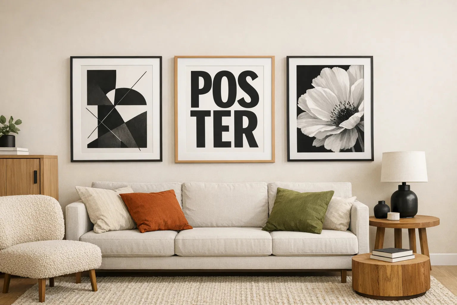
If your wall is large, small prints can look like afterthoughts. A single larger poster often looks more “gallery” than three small ones. As a rule of thumb, aim for art that fills a meaningful portion of the wall area above a sofa or console, instead of floating in the middle.
Framing trends for black and white posters in 2025
The frame is not just protection, it’s part of the composition.
Slim frames are still dominant, but warmer finishes are rising
Black frames are classic, but warm minimalism has pushed light wood and soft-toned oak into the mainstream. Both work well with monochrome because they add warmth without introducing colour into the art itself.
Wider mounts (mat boards) feel more premium
In 2025, mounts are getting wider because they create “gallery spacing” around the artwork. This makes even a simple print feel intentional and gives the eye a resting zone.
Matte finishes are preferred for lived-in rooms
If you have windows opposite the wall, glossy surfaces can create glare that flattens the image. A matte print surface and glare-reducing glazing tends to make monochrome look richer in everyday lighting.

Styling ideas that make monochrome feel current (not cold)
A common worry is that black and white posters will make a room feel stark. The 2025 approach is to balance them with warmth and texture.
Pair monochrome art with tactile neutrals
If your posters are crisp and graphic, soften the room with materials like boucle, brushed cotton, wool, linen, leather, and raw timber. The contrast between smooth ink and tactile textiles is what makes the space feel designed.
Use one accent colour, max
Black and white art gives you permission to use a single accent colour more confidently (rust, olive, ochre, cobalt). The posters keep the room coherent.
Repeat black in small ways
To avoid “random black rectangles on a wall,” echo black elsewhere:
- a lamp base
- cabinet handles
- a small side table
- a mirror frame
(You only need two or three repeats for it to feel cohesive.)
Common mistakes to avoid with black and white posters
Choosing prints that are too similar in tone
If you’re hanging multiple pieces, avoid selecting five mid-grey images. Mix at least one high-contrast piece with one softer piece so the wall has rhythm.
Hanging too high, especially with minimalist art
Minimalist posters often have lots of white space, so if they’re hung too high they can feel disconnected from the furniture. Keep the relationship between art and sofa/console intentional.
Overcrowding a wall with small frames
A busy cluster can dilute monochrome’s strength. If you love variety, vary subject matter (photo plus line art plus typography) rather than adding more frames.
Bringing it home: building a 2025-ready monochrome set
If you’re updating your space this year, start with one decision: do you want your black and white posters to feel graphic, gallery-like, or atmospheric? Pick one hero piece in that direction, then add one supporting print that contrasts it (for example: architecture plus ink wash, or typography plus botanical).
Dreamprint.art’s approach of made-on-demand prints, multiple size options, and optional framing makes it easier to build a cohesive look without settling for “close enough.” If you’re aiming for a clean 2025 refresh, black and white is still one of the highest-impact changes you can make without repainting a room.

