
Cart
0
Crisp detail, accurate colour and the right paper choice can turn a good photo into a print that stops people in their tracks. Whether you are preparing files for a pro lab or printing at home, this practical guide covers the key settings and paper tips that make the biggest difference to photo print quality.

Start with a strong capture
Print quality begins long before you click Export.
- Shoot RAW whenever possible, it preserves colour and tonal latitude for editing and printing.
- Use the lowest ISO you can maintain, noise is far more visible on paper than on screens.
- Keep shutter speed fast enough to avoid motion blur, and use a tripod when detail matters.
- Fill the frame and mind aspect ratio. If you plan to print 3:2 sizes like 12 x 8 or 30 x 20 inches, compose with minimal cropping in mind.
Resolution and PPI, what you really need
Printers render at a certain pixel density. For most lab and home inkjet prints, 300 PPI at the final print size is a safe target. For large wall art viewed from further away, 240 PPI is usually indistinguishable from 300 PPI.
- Formula: required pixels = print inches × target PPI.
- If your file falls short, upsize with high quality algorithms and sharpen after resizing.
| Print size | Min pixels at 300 PPI | Min pixels at 240 PPI |
|---|---|---|
| A4 (8.27 × 11.69 in) | 2481 × 3507 | 1985 × 2806 |
| A3 (11.69 × 16.54 in) | 3507 × 4962 | 2806 × 3970 |
| 12 × 8 in | 3600 × 2400 | 2880 × 1920 |
| 16 × 12 in | 4800 × 3600 | 3840 × 2880 |
| 24 × 16 in | 7200 × 4800 | 5760 × 3840 |
| 30 × 20 in | 9000 × 6000 | 7200 × 4800 |
Notes:
- Many inkjet printers internally work near 300 to 360 PPI, so feeding 300 PPI files typically yields optimal results.
- Do not confuse PPI (file pixels per inch) with printer DPI (ink dot density). Match PPI to your print size, let the printer handle DPI.
Colour management that actually works
Accurate colour is a chain, and it is only as strong as its weakest link.
- Calibrate and profile your monitor regularly. Target D65, gamma 2.2, and a screen brightness around 80 to 120 cd/m² to better match print viewing. Tools from companies like X-Rite, monitor calibration tools make this straightforward.
- Work in a consistent colour space. Unless your lab requests otherwise, export sRGB. If your lab accepts Adobe RGB or ProPhoto RGB for wider gamut, confirm their specs first.
- Embed the ICC profile in your exported file, this communicates the colour space to the printer. Learn more from the International Color Consortium (ICC).
- Soft proof before printing. Use your lab’s paper ICC profiles if provided, then simulate the paper white and choose a rendering intent. Adobe explains the process here, see soft proofing.
Rendering intent tips:
- Relative colourimetric, best when most colours fit the target gamut, keep neutrals clean, enable black point compensation.
- Perceptual, better when many colours are out of gamut, compresses gently to preserve relationships.
File prep and export settings
Editing workflow refinements that make prints pop without halos or banding:
- Finish all tonal and colour edits at full resolution first.
- Resize to final print dimensions at your target PPI.
- Output sharpen for the specific medium, paper needs different sharpening than screens.
Sharpening guidelines:
- Matte and cotton rag papers absorb more ink, they can take slightly stronger output sharpening.
- Glossy and baryta papers are already high contrast, use lighter sharpening to avoid halos.
- In Lightroom Classic: Output Sharpening set to Print, choose Glossy or Matte, Amount Standard is a safe start.
Export formats:
- JPEG, quality 90 to 100, 8‑bit, sRGB unless your lab specifies a different profile.
- TIFF, 16‑bit for maximum headroom when the lab accepts it, especially for critical fine art prints.
Margins, borders and bleed:
- For borderless prints, expect a small expansion and potential cropping at the edges. Keep vital content 3 to 5 mm inside the safe area.
- For framed pieces with a white border, add the border in your export to control proportions and mat alignment.
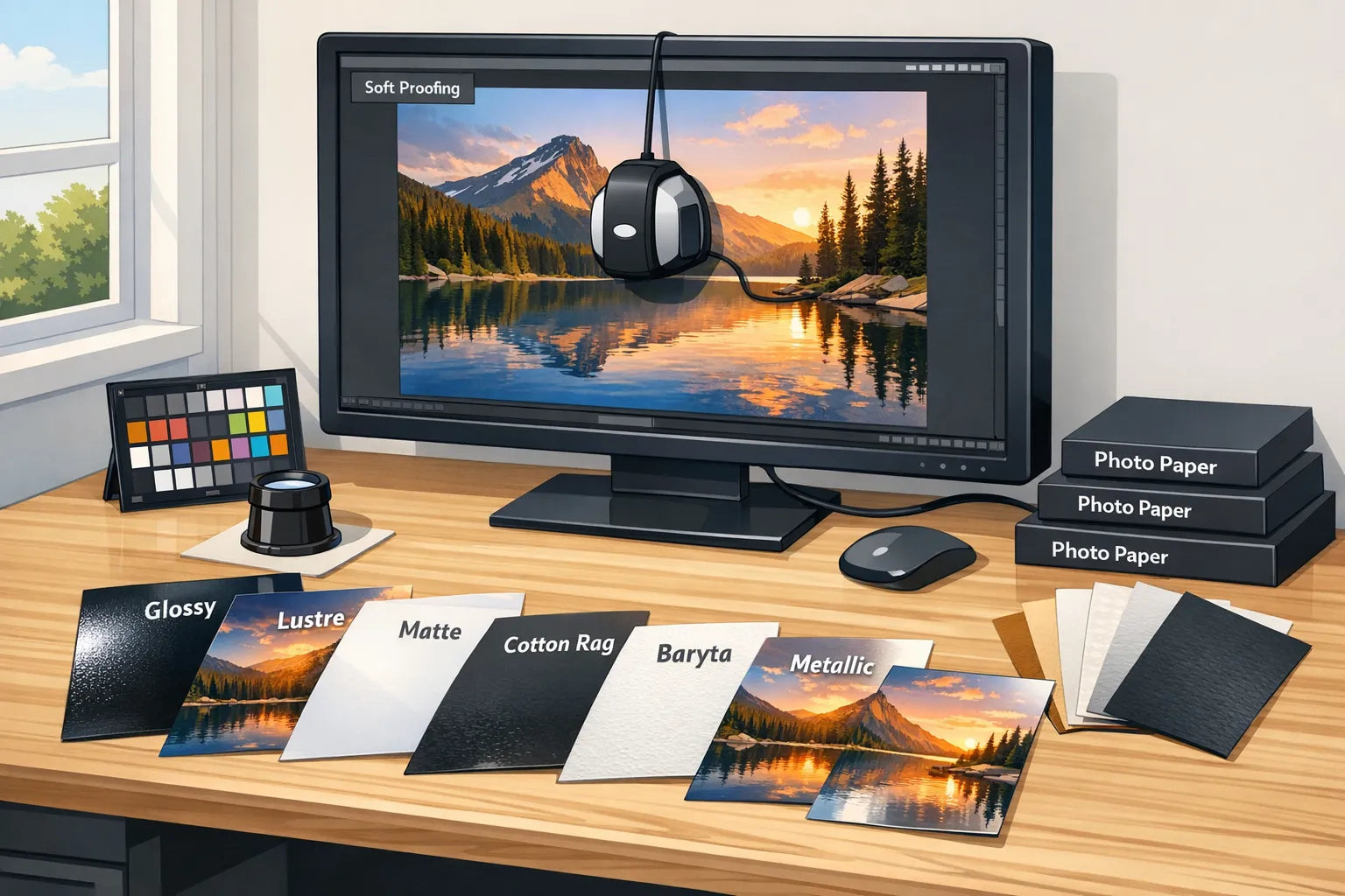
Paper types explained, how they change the image
Choosing paper is like choosing a lens for the final look. It affects contrast, colour saturation, perceived sharpness and viewing comfort.
| Paper type | Look and strengths | Best for | Watch-outs |
|---|---|---|---|
| Glossy | Highest contrast and saturation, deep blacks, crisp detail | Vivid landscapes, colourful travel, high impact images | Glare under strong light, fingerprints, reflections in frames |
| Lustre, satin or pearl | Balanced sheen, strong colour, good detail with reduced glare | Portraits, weddings, general purpose display | Slight surface texture can show in specular highlights |
| Matte (RC) | Low glare, smooth tones, subtle look | Soft portraits, muted palettes, gallery lighting | Blacks appear lighter than on glossy, requires careful sharpening |
| Cotton rag (fine art matte) | Tactile texture, museum aesthetic, gentle tonal transitions | Fine art, black and white, painterly images | Lower Dmax than gloss, may need stronger contrast and sharpening |
| Baryta (fibre gloss) | Classic darkroom feel, rich blacks, smooth gloss, high micro-contrast | Monochrome, classic portraiture, detailed landscapes | Slight sheen can still reflect light, handle carefully |
| Metallic | Iridescent pop, enhances specular highlights | Night scenes, chrome, abstract | Not suited to subtle skin tones, reflective look is subjective |
Additional paper considerations:
- Paper weight and feel, heavier papers (measured in gsm) feel more premium and lie flatter.
- Optical brightening agents (OBAs) increase brightness, but may affect long term colour stability. For maximum longevity, consider OBA-free fine art papers. Independent data at print permanence testing.
- Explore reputable paper makers’ ranges to match your image and display conditions. A helpful starting point is Hahnemühle’s fine art paper guide.

Black and white printing without colour casts
- Convert deliberately, tone with care and avoid clipping in the shadows.
- For home printing, use the printer’s dedicated black and white mode if available, it neutralises colour casts.
- On baryta and cotton rag papers, subtle split tones look elegant and hold well over time.
Lighting and framing for the best viewing experience
- Display lighting changes how prints look. Aim for neutral lighting, around 5000 to 6500 K, and avoid mixed light sources.
- Under glass, lustre or matte papers reduce distracting reflections. If you prefer glossy prints, consider anti-reflective glazing for frames.
- Use acid-free mounts and backing to help preserve your print.
Quick pre-print checklist
- Calibrated display at D65, gamma 2.2, correct brightness.
- Final crop at the exact aspect ratio for your print size.
- Soft proof with the target paper profile, adjust contrast and saturation as needed.
- Resize to final dimensions at 300 PPI (or 240 PPI for large display prints).
- Apply output sharpening for your chosen paper surface.
- Export in the colour space and file format your lab requests, embed the profile.
- Add borders or bleed intentionally, keep key content inside a safe margin.
For studios and SMEs
If you manage high volumes of print orders, quotes and client approvals, operational bottlenecks can erode quality. Centralising intake specs, automating follow-ups and keeping your CRM up to date helps every file arrive print-ready. Platforms focused on AI-powered workflow automation can streamline repetitive admin, so your team spends more time on colour checks and proofs, and less on manual coordination.
Frequently asked questions
Is 300 PPI mandatory for great prints? No, 300 PPI is a strong general target. For larger wall art viewed from a distance, 240 PPI is typically indistinguishable. Prioritise good capture, careful editing and output sharpening.
Should I export sRGB, Adobe RGB or ProPhoto RGB? Unless your lab specifies otherwise, use sRGB and embed the profile. If your provider accepts Adobe RGB or ProPhoto RGB and you edited in that space, you may retain slightly more gamut, but confirm their requirements first.
Do I need a calibrated monitor? For consistent results, yes. Uncalibrated screens are often too bright and too cool, which leads to dark, dull prints. Use a hardware calibrator and profile at D65, gamma 2.2, and about 80 to 120 cd/m².
What is soft proofing and when should I use it? Soft proofing simulates the paper and printer gamut on your screen. Use it before exporting to see if colours clip or shadows block up, then adjust with a suitable rendering intent. See Adobe’s guide to soft proofing.
How much should I sharpen for print? Sharpen after resizing to the final print size. Matte papers usually need a bit more output sharpening than glossy or baryta. Avoid halos by zooming to 50 to 100 percent while judging edges.
Which paper is best for portraits? Lustre or satin is a reliable starting point because it keeps skin tones natural with minimal glare. For a fine art look, try cotton rag; for classic punchy monochrome, consider baryta.
Are OBAs bad for longevity? Not necessarily, but OBA-free papers are often preferred for archival work. If longevity is critical, consult independent data such as print permanence testing.
How large can I print a modern smartphone photo? Many current phones produce 12 to 48 MP files. With good light and careful processing, sizes like A3 and 16 × 12 in can look excellent. Low light or heavy noise reduction may limit usable size more than resolution does.
Ready to enjoy gallery-quality results without the guesswork?
If you would rather skip the technical prep, explore ready-to-hang art at dreamprint.art. We curate contemporary works from top artists, print on demand in multiple sizes with optional framing, and ship worldwide with free delivery. Choose by theme or colour and refresh your space with pieces that arrive ready to display.
Get Inspired: Photography Prints with Exceptional Quality
Now that you know how to achieve the best photo print quality, here are some stunning photographic prints from our collection that showcase what's possible with the right settings and paper:

This breathtaking landscape photograph demonstrates the importance of proper colour management and high resolution. Printed at 300 DPI on premium photo paper, the subtle pink gradations in the sky and sharp details in the clouds showcase what's achievable with optimal export settings.

The rich textures and architectural details in this photograph are beautifully preserved through proper sharpening for print. The semi-gloss paper enhances the depth and tonal range, proving how the right paper choice complements technical excellence.

This serene maritime scene benefits from accurate colour profiling and proper bit depth export. The smooth tonal transitions in the water and sky demonstrate why working in 16-bit and converting to sRGB for printing delivers superior results.

The vibrant colours and crisp details in this composition showcase the impact of proper resolution and colour space management. Printed on high-quality matte paper, the image maintains its clarity and colour accuracy without any visible pixelation.

This striking image with its bold colour spectrum illustrates why proper colour management is crucial. The smooth gradients and saturated hues are perfectly rendered through careful attention to colour profiles and print settings, resulting in a gallery-worthy print.
Looking for more inspiration? Browse our Summer posters collection for bright, vibrant photography, or explore our Winter posters collection for atmospheric seasonal scenes that showcase exceptional print quality.

