
Cart
0
Choosing the best paper for art prints is the single biggest decision that affects how your piece looks, feels and lasts. The paper controls colour, contrast, perceived sharpness, texture and even how much glare you see once the work is framed. There is no one-size-fits-all answer, there is only the best paper for your artwork and your space. This buyer’s guide explains the options in plain language so you can purchase with confidence.
Why paper choice matters
- Colour and contrast: Different coatings and whites shift saturation and black depth. The same file can look punchy on glossy photo paper and softly elegant on cotton rag.
- Texture and tactility: Smooth stocks emphasise detail, textured stocks add a painterly feel that suits illustration and watercolour reproductions.
- Longevity: Archival, acid free and lignin free papers with pigment inks can last decades when framed correctly. Independent testing by Wilhelm Imaging Research shows certain pigment ink on fine art papers can exceed 100 years of display life behind glass.
- Practicality: In bright rooms a matte finish controls reflections, in dim rooms a satin or gloss finish can add visual depth.

Quick picks by artwork and room
Use these starting points, then refine using the sections below.
| If you want | Choose | Why |
|---|---|---|
| Photographic realism and rich blacks | Baryta fibre gloss or satin, 300–340 gsm | Deep D‑max, classic darkroom look, superb for black and white and colour photo work |
| Versatile, low-glare display in mixed lighting | Lustre or satin RC photo paper, 250–300 gsm | Balanced sheen, great colour, resists fingerprints and glare |
| Soft, museum-like feel for illustrations or paintings | Cotton rag matte, 290–320 gsm, smooth or textured | Archival, tactile surface, gentle highlights and beautiful mid-tones |
| Graphic posters with bold colour and type | Premium matte poster stock, 180–230 gsm | Crisp lines, non-reflective, cost effective for larger sizes |
| Metallic highlights and a modern look | Metallic or pearl RC, 260–290 gsm | Pearlescent sheen adds sparkle to certain photographs and digital art |
| High humidity areas like kitchens or bathrooms | RC photo papers or canvas, framed with sealed glazing | Coating handles moisture better than uncoated rag papers |
How to read paper specifications
Understanding a few key terms turns a product page into a straightforward spec sheet.
- Weight, gsm: Heavier usually means stiffer and more premium. Poster stocks often start near 170–200 gsm, fine art papers typically 290–320 gsm. Very heavy papers can be harder to frame without proper mounting.
- Base, fibre: Cotton rag and alpha cellulose are common. Cotton rag is naturally lignin free and often chosen for archival fine art. Alpha cellulose papers can also be archival when buffered and acid free.
- Coating: RC (resin coated) photo papers deliver high colour gamut, great blacks and moisture resistance. Fibre or baryta papers emulate traditional darkroom fibre paper with a barium sulphate layer for superb depth. Matte fine art papers use inkjet receptive coatings designed for subtle tonal rendering.
- Finish: Matte has no sheen and minimal glare. Satin or lustre offers a gentle sheen. Gloss gives maximum punch and perceived sharpness. Metallic or pearl adds a reflective sparkle that suits specific images.
- Whiteness and OBAs: Optical brightening agents make paper look extra bright. They can very slightly shift colour in UV-heavy light. OBA-free papers are more cream or natural white, often preferred for archival display. Hahnemühle and other manufacturers provide guidance on OBAs and whiteness; see their technical resources at Hahnemühle FineArt.
- Archival, acid free, lignin free: These terms signal long-term stability when paired with pigment inks and proper framing. Standards like ISO 9706 define permanence requirements for paper composition.
- Surface texture: Smooth, hot-press style papers keep detail razor sharp. Textured, cold-press style papers add tooth that flatters painterly work and softens edges slightly.
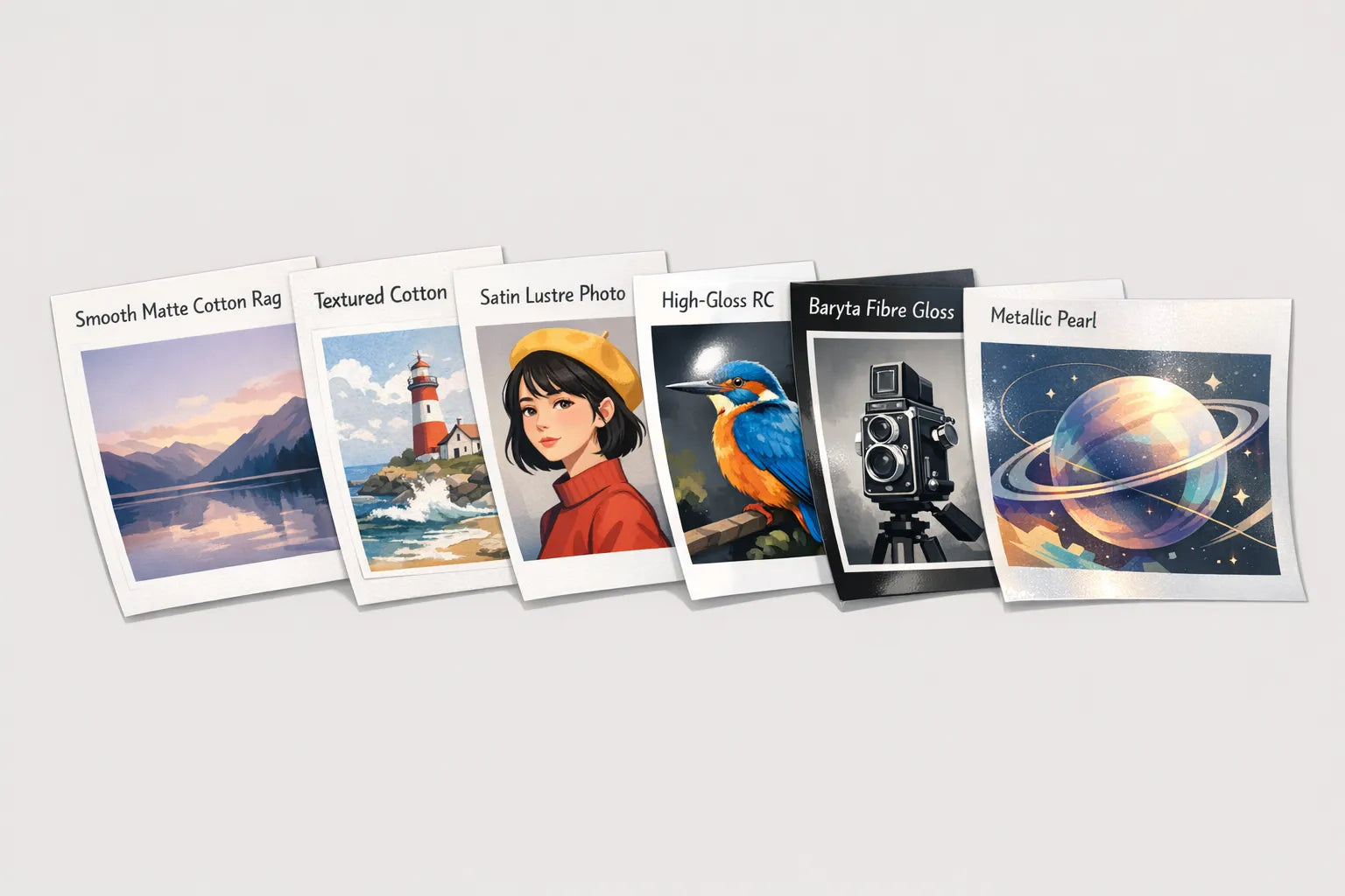
Paper types explained
Below is a practical overview of the main categories you will encounter when shopping for art prints and posters.
| Paper type | Typical finish | Typical weight | Best for | Strengths | Watch outs |
|---|---|---|---|---|---|
| Poster paper, premium matte | Matte | 170–230 gsm | Bold graphic posters, typography, illustration | Non-reflective, crisp lines, budget friendly at scale | Not as deep blacks as photo gloss, less tactile than cotton rag |
| RC photo paper, lustre or satin | Semi-gloss | 250–300 gsm | Photography, mixed lighting spaces | Excellent colour and black depth, reduced glare, tough surface | Slight sheen still shows some reflections in strong light |
| RC photo paper, gloss | Glossy | 250–300 gsm | High-impact colour photo prints | Maximum punch and perceived sharpness | Glare under bright light, fingerprints if unglazed |
| Baryta fibre gloss or satin | Gloss to semi-gloss | 300–340 gsm | Fine photography, especially black and white | Deep D‑max, classic fibre look, rich tonal separation | Costs more, needs careful handling when framing |
| Cotton rag matte, smooth | Matte | 290–320 gsm | Illustration, paintings, minimal glare interiors | Museum feel, archival, beautiful mid-tones | Blacks look softer than on gloss, surface can scuff if unprotected |
| Cotton rag matte, textured | Matte | 300–320 gsm | Watercolour and textured media reproductions | Adds tactility, hides minor surface marks | Slight loss of micro-detail due to texture |
| Metallic or pearl RC | Pearlescent | 260–290 gsm | Images with specular highlights, night scenes, chrome, water | Striking highlights, modern aesthetic | Can feel too sparkly for portraits or soft art |
| Canvas (non-paper) | Matte or satin | 350–450 gsm equivalent | Large statement pieces, glare-free displays | No glass needed, softens noise, great in bright rooms | Texture may not suit fine text or small type |
Match paper to your art and your room
Start with the artwork, then factor in lighting and framing.
- Subject and style: Architecture and macro detail lean toward smoother surfaces. Painterly illustration and watercolour love textured matte. Black and white photographs benefit from baryta for tonal depth.
- Lighting: In bright rooms or opposite windows, matte papers avoid mirror-like reflections. In dim or controlled lighting, a satin or gloss elevates colour and contrast.
- Viewing distance and size: Large prints viewed from across the room do not need ultra-gloss to look sharp. Smaller prints viewed up close can benefit from the added snap of satin or gloss.
- Environment: For kitchens and bathrooms, choose RC photo papers or canvas and frame with sealed glazing. For sunny walls, consider UV-filter glazing and avoid direct sunlight where possible.

Framing and glare, the often-overlooked half of the equation
Even the perfect paper can be spoiled by the wrong glazing.
- Standard glass is reflective. Pairing it with matte paper reduces distractions.
- Acrylic glazing is lighter and shatter resistant. Museum-grade acrylic or glass adds UV filtration and anti-reflective coatings that dramatically cut glare and protect colour.
- Use acid free mounts and backing. Spacers or mounts prevent the print from touching the glazing, which avoids Newton rings and sticking.
- For fine art cotton papers, professional hinge mounting with conservation materials is recommended. Avoid pressure-sensitive tapes directly on the artwork.
Budget, value and when to upgrade
- Entry level, posters and dorm-friendly décor: Premium matte poster paper delivers clean colour, minimal glare and excellent value, especially in larger sizes.
- Mid-tier, versatile and durable: Lustre or satin RC photo stocks are workhorses, with great colour and resilience. They are an easy recommendation for gifts and living rooms.
- Top tier, heirloom feel: Cotton rag matte or baryta fibre stocks provide a museum-like presence and the most satisfying blacks for photography. If you are investing in a centrepiece for your home or office, this is where paper truly elevates the work.
Archival and sustainability considerations
If you want your print to stay beautiful for decades, these points matter.
- Archival build: Look for acid free and lignin free language. When combined with pigment inks and proper framing, this supports long-term stability.
- OBA choices: Bright-white papers with OBAs look crisp but can read slightly cooler under UV heavy lighting. OBA-free papers are warmer and often chosen for conservation framing.
- Responsible sourcing: Forest certification schemes such as FSC indicate wood pulp papers come from responsibly managed forests. Many cotton papers use recovered linters from textile manufacturing.
Simple steps to decide in under five minutes
- Decide the vibe, soft and tactile or glossy and punchy.
- Check the room lighting. If it is bright or near windows, lean matte. If it is controlled or dim, consider satin or gloss.
- Match the subject. Illustration or watercolour, choose cotton rag matte. Photography, choose lustre or baryta.
- Consider framing. If you will use standard glass, avoid very glossy papers in bright rooms. If you will use anti-reflective glazing, any finish works.
- Balance budget with impact. If you can, upgrade the focal piece to cotton rag or baryta, and use premium poster or lustre elsewhere.
Buying at dreamprint.art
All prints at dreamprint.art are made on demand and shipped worldwide, which means your artwork is produced fresh for you. Paper options vary by artwork and edition, so always check the specification on the product page before you choose your size and framing.
- Browse curated artwork by subject or palette using Shop by theme or colour. Start here: Shop by theme and Shop by colour.
- When comparing options, note the finish and base described on each product page, for example matte fine art or lustre photo.
- If you are unsure, a safe default for mixed lighting is a lustre or satin photo finish, while cotton rag matte is ideal for painterly pieces.
- For display planning and hanging strategies, read our guide to creating a cohesive layout: How to create the perfect gallery wall.
If you need help selecting paper for a specific room or style, get in touch with support on dreamprint.art so we can point you to the most suitable finish.
Pro tips from printmakers
- Warm versus bright white: Natural white cotton papers can add a gallery feel to portraits and paintings. Bright white papers make colours pop in graphic work and design-led posters.
- Black and white nuance: For truly deep blacks and silvery highlights, baryta remains a favourite among photographers. For a soft, matte aesthetic, cotton rag delivers gentle roll-off in the shadows.
- Scale honestly: Very large glossy prints can show reflections across a room. On large formats in bright spaces, matte or lustre tends to be more forgiving.
- Protect your investment: Frame with UV filtering glazing, keep away from direct sun, and dust with a soft, dry cloth. Avoid aerosol cleaners near the frame.
The bottom line
The best paper for art prints depends on your artwork, your lighting and your framing. If you want gloss and drama, choose RC gloss or baryta. If you want subtlety and a museum feel, choose cotton rag matte. If you want a robust, do‑everything option, choose lustre or satin. Start with where the print will live, then pick the paper that helps it look its best there.
Ready to find the right piece for your space? Explore our curated Collections and choose the finish that fits your art and your room.
Get Inspired: Beautiful Prints on Premium Paper
Now that you understand paper types, here are some stunning art prints from our collection that showcase how the right paper can elevate your artwork:

This charming illustration with its rich colors and fine details looks exceptional on matte paper, where the non-reflective surface allows you to appreciate every whisker and texture without glare interfering with the whimsical composition.

The vibrant oranges and Mediterranean blues in this artwork truly pop on semi-gloss paper, where the subtle sheen enhances the sun-drenched feeling while maintaining excellent color saturation and depth.

This retro-inspired design benefits from the smooth finish of semi-gloss paper, which gives the bold graphics and vintage color palette a contemporary edge while preserving the nostalgic aesthetic.

The bold, graphic nature of this floral design is beautifully complemented by matte paper, which provides a sophisticated, modern finish that works perfectly in minimalist and Scandinavian-inspired interiors.

This atmospheric piece with its subtle color gradations and delicate details is stunning on archival matte paper, where the museum-quality finish ensures the moody tones remain rich and fade-resistant for years to come.
Looking for more inspiration? Browse our Spring posters collection for fresh, seasonal artwork, or explore our Summer posters collection for vibrant pieces that bring warmth to any space.

