
Cart
0
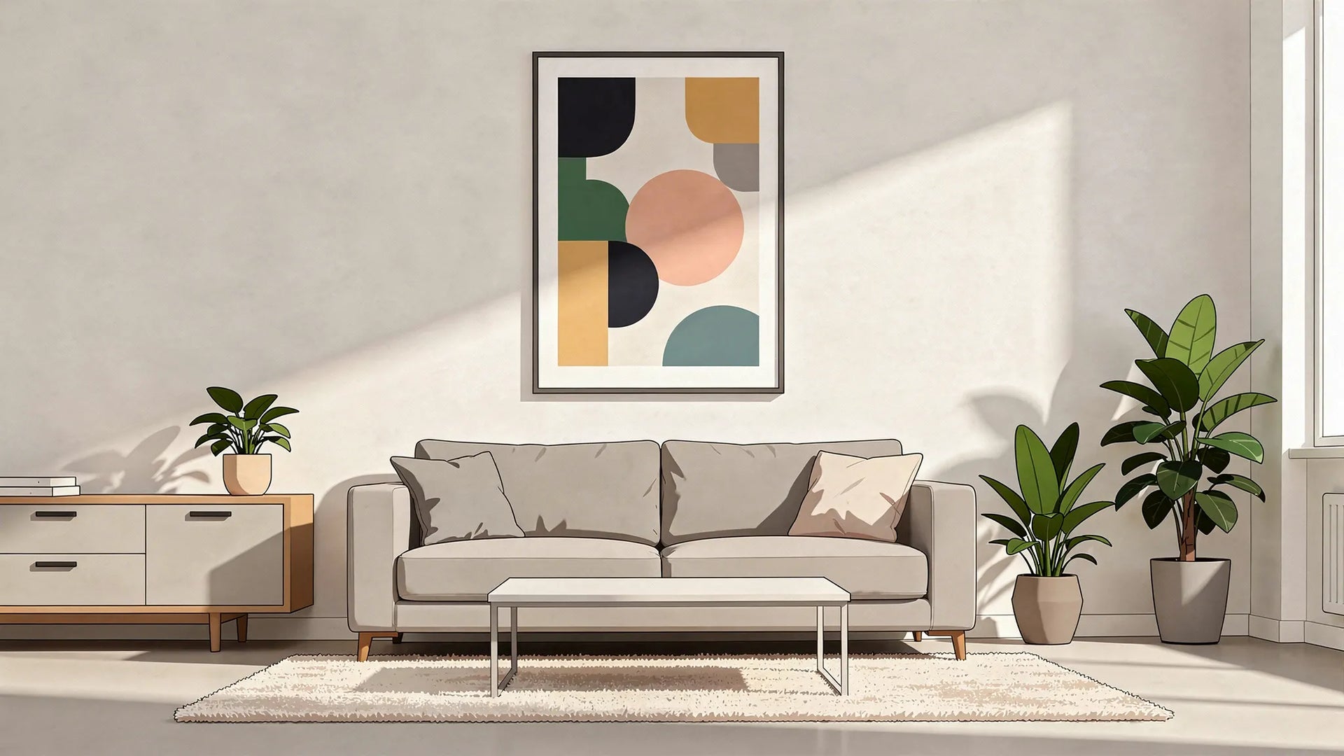
Big walls are a gift until they turn into a wide, blank “something’s missing” zone. The quickest way to make a large wall feel intentional (without committing to a full gallery wall) is to use one confident, oversized artwork or a small set of well-scaled pieces.
A 70x100 cm poster hits a sweet spot: it is big enough to read as a focal point from across the room, but still easy to frame, move, and style as your space evolves.
Why 70x100 cm posters work so well on large walls
When you are decorating a big wall, the most common mistake is choosing art that is simply too small. Scale matters because our eyes judge the “visual weight” of a wall in seconds.
A 70x100 cm piece helps because:
- It creates a clear focal point (especially in living rooms and bedrooms).
- It is large enough to anchor furniture like a sofa, sideboard, or bed.
- It stays flexible: one statement piece, a pair, or a clean grid can all work at this size.
Portrait or landscape? Both can be right, depending on what the wall needs.
- Portrait (70 wide x 100 high) emphasises height. Great for narrow walls, hallways, and corners that feel “tall and empty”.
- Landscape (100 wide x 70 high) emphasises width. Great above sofas, beds, and long consoles.
Start with the wall: choose a layout that fits the space
Before you pick a design, decide how many pieces you want and what role they should play.
The three most reliable big-wall layouts (using 70x100 cm)
1) One hero piece
If your style is minimal, modern, or Scandinavian, one 70x100 cm poster can be enough. This works best when the wall is not competing with lots of shelves, windows, or busy patterns.
2) A pair (diptych)
Two 70x100 cm posters side-by-side are a strong solution for very wide walls (behind a large sofa, above a long dining bench, or across a spacious landing). It also lets you mix themes: colour + monochrome, abstract + photography, bold + calm.
3) A clean grid (2x2)
Four pieces can feel “architectural” and balanced, especially in open-plan spaces. A 2x2 grid using the same size creates structure without the complexity of a gallery wall.
A practical sizing guide for big walls
Use this table to sanity-check scale before you buy or hang anything.
| Wall situation | What usually looks balanced | Why it works |
|---|---|---|
| Medium wall with one focal zone (for example above a small sofa or console) | 1x 70x100 cm | Big enough to read as a statement without dominating |
| Wide wall above a 2.5 to 3-seater sofa | 2x 70x100 cm (side-by-side) | Matches the sofa’s visual weight and fills width naturally |
| Large open-plan wall that feels “echoey” | 2x 70x100 cm or a 2x2 grid | Repeats scale and adds rhythm across the wall |
| Stair wall or tall hallway | 1x 70x100 cm in portrait (or 2 stacked) | Uses vertical height and draws the eye upward |
Place it correctly: height, spacing, and breathing room
Even perfect art can look wrong if it is hung too high or floats awkwardly. These are the placement rules that make 70x100 cm posters look “designer” rather than “random”.
Use eye level as your baseline
A widely used gallery guideline is to hang art so the centre sits around eye level, often quoted around 57 inches (about 145 cm) from the floor. Many framing and interior design resources reference this as a dependable default.
If you want a quick reference, see Framebridge’s guidance on how high to hang pictures.
Anchor art to furniture (do not let it float)
If your poster is above furniture, the relationship matters more than the absolute wall height.
Good starting points:
- Above a sofa or headboard: leave roughly 15 to 25 cm between the top of the furniture and the bottom of the frame.
- Above a console or sideboard: 10 to 20 cm often looks best.
Another useful rule is proportion: many designers aim for artwork that is roughly two-thirds to three-quarters the width of the furniture beneath it. (You can check a similar rule of thumb in The Spruce’s guide to hanging art the right way.)
Spacing between multiple 70x100 cm posters
If you are hanging two or more pieces, consistent spacing is what makes it feel intentional.
- Between two posters: aim for 5 to 8 cm.
- In a grid: keep spacing identical horizontally and vertically.
On very large walls, slightly wider spacing can work, but keep it consistent.

Make the wall feel “filled” without clutter: use visual weight
Filling a big wall is not only about size. It is also about contrast, colour, and composition, which determine how heavy or light the wall feels.
Use contrast to control attention
- High-contrast posters (black and white photography, bold graphic shapes, strong typography) read clearly from across a room and suit big, open areas.
- Low-contrast posters (soft neutrals, misty landscapes, tone-on-tone abstracts) make a room calmer, but they often need either closer viewing distance or stronger framing to avoid fading into the wall.
Consider your wall colour
- On a white wall, almost any palette works, but subtle art may need a frame that creates a crisp edge.
- On a dark wall, mid-tone and bright artworks pop, and light mats can add breathing room.
- On a colourful wall, choose art that either harmonises (similar undertones) or deliberately contrasts (complementary colours).
If you want a colour-theory refresher, the Interaction Design Foundation has a clear overview of colour theory basics.
Framing choices that help 70x100 cm look premium
Because 70x100 cm is large enough to feel like a “real piece”, framing makes a huge difference in how finished it looks.
Pick a frame style that matches the room’s lines
- Black frame: sharp, modern, strong contrast, ideal for graphic art and photography.
- White frame: airy, minimal, great for bright rooms and soft palettes.
- Natural wood: warm, timeless, works especially well with earthy or Scandinavian interiors.
Add a mount (mat) when you want breathing room
A mount can make the artwork feel more “gallery” and less “poster”, especially if the wall is busy or the colours are soft. It also helps when you want the piece to feel larger without adding more frames.
Watch out for glare
Large framed prints can catch reflections (windows, overhead lights). If you notice glare:
- Move the art slightly away from direct light lines.
- Consider softer lighting angles.
- Avoid placing it opposite a bright window when possible.
Room-by-room ideas: where 70x100 cm looks best
Living room: the easiest big-wall win
If you have a sofa on a long wall, a single 70x100 cm can work if the sofa is compact. For larger sofas, a pair of 70x100 cm posters is often the fastest way to make the wall feel complete.
Style tip: repeat one colour from the artwork in cushions or a throw. This ties the wall to the seating area without matching everything.
Bedroom: calm statement above a headboard
A landscape-oriented 70x100 cm above the bed feels restful and balanced. If you want a more boutique-hotel look, use two posters with similar palettes.
Style tip: keep the artwork’s mood consistent with the room’s purpose. Softer contrast and fewer “busy” details usually feel better in bedrooms.
Home office: create a focus point behind the desk
A 70x100 cm poster behind a desk can make video calls look polished and intentional. Choose art with clear shapes or readable composition from a distance.
Style tip: if you have shelves or storage units, keep the art centred within the “work zone” rather than centred on the entire wall.
Hallway or landing: make transitional spaces feel designed
Tall or empty hallways often need vertical emphasis. A portrait 70x100 cm instantly creates that.
Style tip: add a slim picture light or directional wall lighting if the hallway is dim. Good lighting makes large prints feel like a feature, not an afterthought.
Dining area: define the zone in open-plan rooms
If your dining table sits in an open-plan space, big wall art helps “mark” the dining area as its own zone.
Style tip: if the table is long, two 70x100 cm posters can balance the width better than one.
Common big-wall mistakes (and quick fixes)
Big walls are unforgiving, but the fixes are straightforward.
- The art looks too small: add a second 70x100 cm piece, or use a mount and a thicker frame to increase presence.
- It is hung too high: lower it so the centre is closer to eye level, or visually connect it to furniture with correct spacing.
- The wall feels busy, not filled: reduce the number of items and increase consistency (same size, same frame style, equal spacing).
- It looks off-centre: centre art to the furniture or “zone”, not necessarily to the entire wall.
- Glare ruins the look: adjust placement relative to windows, and use lighting angles that graze the artwork rather than hit it head-on.
Frequently Asked Questions
Is a 70x100 cm poster big enough for a large wall? Yes, for many rooms it is a strong statement size. On very wide walls (especially above large sofas), using two 70x100 cm posters or a small set often looks more balanced.
Should I choose portrait or landscape for 70x100 cm posters? Choose portrait to add height (hallways, narrow walls, corners) and landscape to add width (above sofas, beds, long consoles). The “right” choice depends on whether your wall needs vertical or horizontal emphasis.
How high should I hang a 70x100 cm framed poster? A reliable default is to hang it so the centre sits around eye level (often referenced near 145 cm from the floor). If it is above furniture, prioritise the gap above the furniture (commonly about 15 to 25 cm above a sofa).
How much space should I leave between two 70x100 cm posters? Typically 5 to 8 cm looks clean and intentional. The key is consistency across the whole arrangement.
Do big posters need frames to look good? Framing is not mandatory, but it usually makes a 70x100 cm piece look more finished and “designed”. A mount (mat) can also elevate the look and add breathing room.
Ready to fill that big wall?
If you want a simple, high-impact way to transform a blank space, 70x100 cm posters are one of the most reliable choices. Pick a layout (one hero piece, a pair, or a clean grid), hang it at the right height, and let scale do the work.
Dreamprint.art offers ready-to-hang art prints made on demand, with multiple size options, framing choices, and free shipping, making it easy to find a piece that fits your wall and your style.

